
Every so often I return to Brian Gallagher’s illustration blog, and I’m always captivated by his handling of buildings. I like how the rendering is actually fairly simple, but they really convey a lot of feeling to me. They are nicely designed and the values are great.
Category Archives: artist
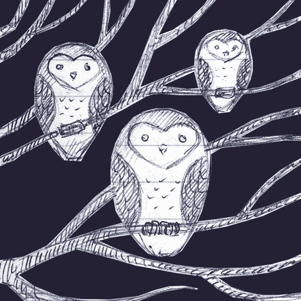
Russ McMullin – Owls, tree, and stars – progress and finish
My latest scratchboard is more illustrative than realistic.

For it I borrowed the basic design of an owl that my sister burned into a wooden spoon.

I wasn’t trying to achieve realism, but I wanted to include at least a hint of it. I started out by doing some sketches


And then I started refining:

Once I settled on the design, I transferred it to a 5×7 board with Chaco paper and red ballpoint pen:

For scratching I used a sharpened steel point that a friend made for me. It works great and has stayed sharp.

Initially the leaves were way too bright and competed with the owls for attention. I inked over them with a Faber Castell PITT artist pen brush, waited for them to dry, and re-scratched them. Even then they seemed too bright:

So, I pushed them back a little further with a diluted ink wash using Ampersand “black repair” that comes with their set of scratchbord inks:

The stars came last to give a background that wouldn’t compete with the owls. I’m feeling pretty good about the result. Now I’m trying to decide if I’m going to add some color.
Excellent scratchboard videos by Cristina Penescu
Cristina Penescu’s work is about as good as it gets in the genre of realistic scratchboard. I can’t think of anyone who has a more consistent portfolio of excellent work.
What sets her work apart from most is her attention to composition and light. She isn’t just taking a photograph and doing her best to mimic it in scratchboard. It’s obvious she is carefully choosing the reference photograph and planning the way it will be presented in the composition, including the background. Her subjects look like they comfortably belong in the space she creates for them on the board. Her use of bright highlights and dark shadows leads the eye on a visual journey through the strongest points of interest. And, her use of airbrush gives her work a greater tonal range than is generally possible with scratching alone.
I also like the fact that she is not afraid to show her work at large sizes. It is easy to admire someone’s work when you can see it in such detail.
I had seen these videos before, and ran across them again as I was researching using an airbrush for scratchboard—something I haven’t yet tried but have a strong desire to try. I wanted to share them here with anyone else who might be interested.

Jeff Gregory – And I saw a pale horse….
According to the site, this is digital scratchboard. It looks like the real thing. This image is part of a larger piece. I actually like the composition of the cropped close-up. 
Will Terry – Audio interview with Society of Illustrators of Los Angeles
This is another post that isn’t specifically about scratchboard, but it does have relevance to artists. It’s about creating art and getting noticed.
A while back I listened to this podcast and I’m finally getting around to posting it. Will Terry is a very good friend of mine and he knows his stuff when it comes to the illustration business – the craft, the marketing – all of it. It’s over an hour of casual conversation as Will talks about work ethic and ways to get people to notice your work. It’s well worth the listen for anyone interested in marketing their creations.
Russ McMullin – Teddy at the Table
Another “just for fun” piece. This is based on a sketch I did a long time ago. It’s more of a conceptual still life than a story—an exercise in composition, light, and value. The rendering is pretty loose so it took me about 3 hours once my sketch was transferred to the 5×7 Ampersand board. I used a #16 X-acto blade for all the scratch work.

Russ McMullin – Church on Agave Hill
My work schedule has been brutal, but I finally found time to finish this piece. My opportunities to do illustration are few these days and this project is one I did for fun. The church is loosely based on one I saw and sketched. The location is plucked from my imagination. The board is 5×7 Ampersand. I used an Olfa 9153US AK-1/5B Standard Art Knife for the scratching. Once the image was transferred to the board it took approximately 4 hours to complete.

Prepare a sketch for scratchboard
With this sketch I took some inspiration from the architecture of a catholic church I passed while on a family outing. The church is tall, yet simple. My drawing doesn’t look much like the church, but it was what got me thinking about it.
The sketch is rendered in blue Papermate ballpoint, my favorite sketching medium. I tend to sketch on lined paper – something I’ve been scolded for. It’s a habit from school and a psychological crutch. I have proper sketchbooks, but generally do better work in lined notebooks because I don’t worry about the outcome.

The snake is not symbolic. It was already on the page when i started the church. The church sketch kept growing until the two ran together. When I pulled the image into Photoshop I erased the snake and cropped the image to a ratio of 5×7.
The bottom of the composition seemed too plain, and I thought it would be nice to have something in the foreground. With a new Photoshop layer and my Wacom tablet I added an agave plant, and played around with the clouds.

Nicolas Delort – A Rumor of Angels
I like the motion in this one.

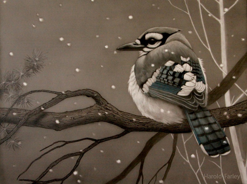
Harold Farley – owl and jay – nice depth
These two pieces by Harold Farley are great examples of giving a composition a sense of depth and atmosphere. Both of these are wonderful. I’m guessing he is using an airbrush to lay down the foggy backgrounds.

I’ve been wondering why I like some scratchboard images more than others, even if the skill level is high. It must have been subconscious at first when I started becoming uncomfortable with the trend to render a subject and leave it floating on a background of solid black. It’s something I have done with my own work, but as time went by I started wondering why I was doing it.
A possible reason for this trend in scratchboard is that a dramatically-lit subject coming out of the darkness has a “cool” factor that gets comments and kudos – nothing wrong with that. Also, after working so hard rendering the subject, it is nice to consider the work finished and to not worry about the background, especially if you feel you just conquered Everest in the details of the subject alone. Speaking for myself, I think it has to do with risk. When it really comes down to it, there is risk involved in adding background or foreground elements. It takes planning, and it takes time to add that additional level of finish. And yet, in the long run, I see a great deal of value in it. Subconsciously I must have been seeking it out because most of the work I find on the net and talk about in my blog has either a background, or additional elements that fill the composition and make it interesting. I finally became aware of what I was doing in my conscious mind and thought I would write about it.
Not every composition needs a background to be successful, but more and more I appreciate works that use most or all of the space in the composition. I like when a “somewhere” is at least implied, even if the piece is still a vignette.