Russ McMullin – Owls, tree, and stars – progress and finish

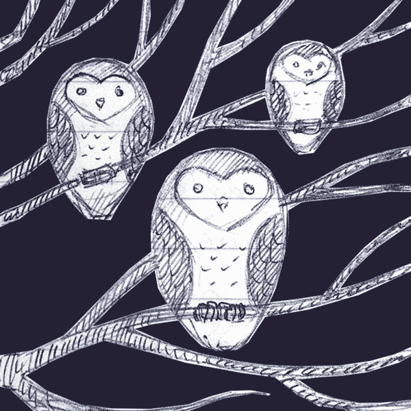
My latest scratchboard is more illustrative than realistic.

owls-trees-and-stars

For it I borrowed the basic design of an owl that my sister burned into a wooden spoon.

michelle-spoon-owls

I wasn’t trying to achieve realism, but I wanted to include at least a hint of it. I started out by doing some sketches

owl-in-tree-sketch

owls-rough-sketch

And then I started refining:

owls-sketch-photoshop

owls-refined-sketch

Once I settled on the design, I transferred it to a 5×7 board with Chaco paper and red ballpoint pen:

owls-transfer

For scratching I used a sharpened steel point that a friend made for me. It works great and has stayed sharp.

my-newest-scratchboard-tools

Initially the leaves were way too bright and competed with the owls for attention. I inked over them with a Faber Castell PITT artist pen brush, waited for them to dry, and re-scratched them. Even then they seemed too bright:

two-owls-bright-leaves

So, I pushed them back a little further with a diluted ink wash using Ampersand “black repair” that comes with their set of scratchbord inks:

owls-trees-and-stars

The stars came last to give a background that wouldn’t compete with the owls. I’m feeling pretty good about the result. Now I’m trying to decide if I’m going to add some color.

Roadside lily in scratchboard

I was going to take some work-in-progress shots of this, and then got too focused on trying to finish. The reference comes from some huge lilies that were growing up the street a while back. The light coming through the pedals made me think it would be a good scratchboard subject. I would love to be done, but I can’t go any further tonight. So far I have about 5 hours in the rendering, maybe 6. The board is a 5×7 Ampersand and I used an Olfa art knife for the scratching.

I’ve got some ideas for a background, but I’m going to test them on another board first. It might be cool to scratch a background pattern and then knock it back a bit with the airbrush that’s been sitting idle, waiting to be experimented with. I hope to post the final by Saturday if all goes well.

UPDATE for Thursday night. Small edits:
lily-for-cami-with-edits

Wednesday night:
lily-for-cami

First impressions of airbrush on scratchboard

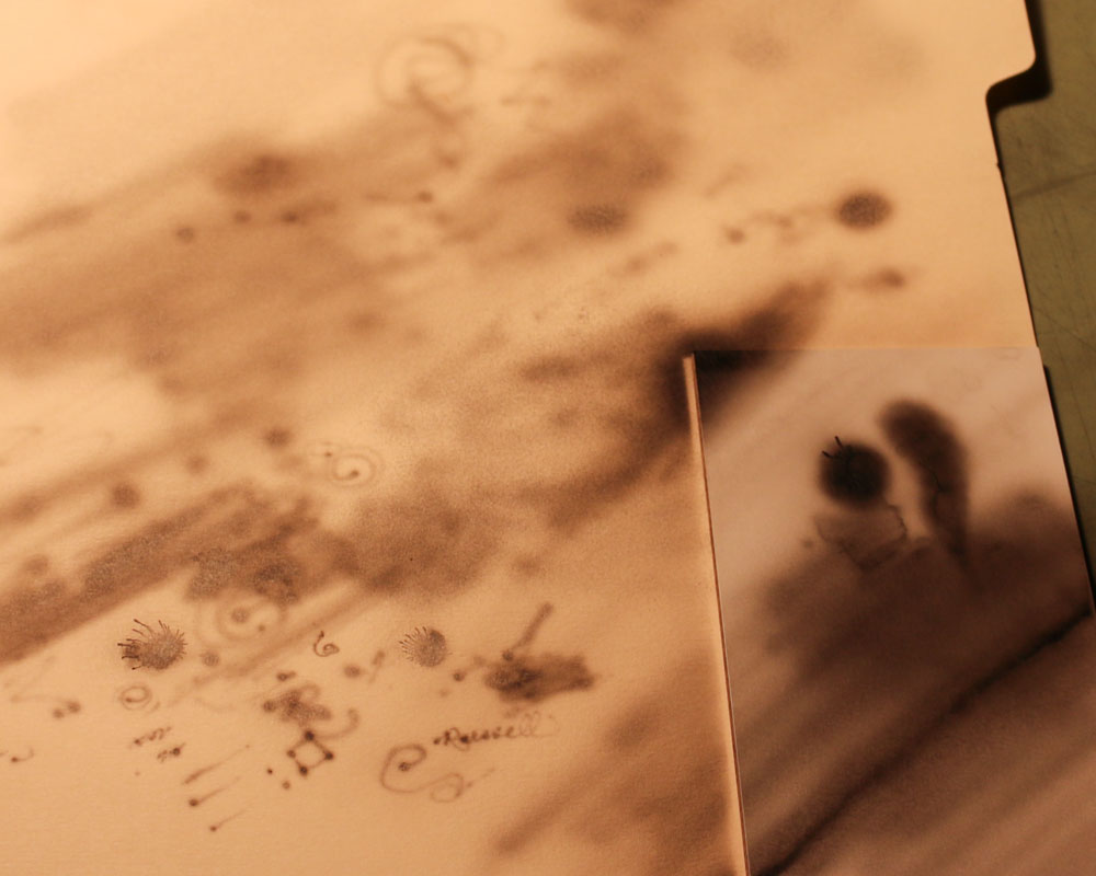
I found just a few minutes to experiment with the airbrush tonight. I first put straight water through the brush to get an idea of how it feels. When I was comfortable with the action, I emptied the water from the cup and wiped it out. I put several drops of Ampersand black ink (straight from the bottle) into the cup and started testing on a manila folder.

With about 20psi on the regulator I experimented with the MAC valve on the airbrush. By turning a little thumbscrew on the bottom of the airbrush you control the air pressure. Very handy.

As long as I was very patient I could get some fairly even gray patches. Building the ink up to solid black takes a while and it seemed I was prone to getting the area too wet. Then the ink would start to spider out. I probably had too much pressure and was working too close.

Dialing the pressure back gives a different pattern. Instead of laying down smoothly, the ink does a very fine spatter pattern. I really need to learn better control of the pressure.

But, even without being good at making solid blacks I can already see some very useful things the airbrush can do. Without much effort I can add a mist of gray to areas that may be overscratched, or that need to be pushed further back.

I used a little sample of Claybord when I got more comfortable with the brush. I made one corner a pretty solid black and made a gradient fade into white. As I got impatient I ran into more problems with spidering. The clay surface is harder and doesn’t absorb like the folder does. Airbrushing requires patience. My experiment looks pretty lame, but it was a very useful exercise.

When I scratched back into the airbrushed ink, I was pleased with the result. After a bit more practice and a better setup of my work area I will start working on something for real.

I need a better place to hang the airbrush

I need a better place to hang the airbrush

Manila folder and Clayboard sample

A manila folder worked well for an experimental surface. The Claybord sample is on the right.

Having fun with the ISSA scratchboard artists at the 3rd Annual Exhibition

This year the International Society of Scratchboard Artists (ISSA) allowed non-members to enter their 3rd annual juried exhibition. The show is hanging in the Page-Walker Arts & History Center in Cary, North Carolina—less than 10 minutes from my house. It will be up until the middle of August.

A couple of ISSA members contacted me several months before the show and encouraged me to enter. Their warm invitation and my close proximity to the gallery helped overcome my tendency to procrastinate. I entered my artwork and looked forward to meeting the artists and attending the workshops associated with the opening of the show. Previous to the show, several artists posted their entries to the Wet Canvas site and I knew the caliber of the artists at the show was going to be high. I had no expectations of winning anything since my entries aren’t based on photographic reference and my level of detail was courser than what I saw in most of the previews.

Friday at 6pm was the reception for the artists. Cami (my wife) and I showed up and we were immediately impressed with the work we saw. The quality was even better up close and the show was bigger than I had expected. It took up the first and second floors.

Ginger Gehres, the ISSA exhibition director, greeted us and made us feel right at home. Cami and I walked around looking at all the art and talking about the art we liked best. I assured her I would not be receiving an award. There were too many great pieces for me to expect that.

There were plenty of other artists milling about and I tried to put faces to names. At 6:30 everyone was called together and the artists were invited to stand at one end of the room. Andrea Shouten, the ISSA president and Elaine Salazar from Ampersand gave out the awards. There was a master division and an open division. As I predicted, all of the awards were given out and my name was not mentioned. That was until they announced the Special Venkat Award of Excellence. I heard “Church on Agave Hill” and thought it sounded very familiar. Suddenly, I realized in disbelief that it was mine. The award was presented by Krish Krishnan, the son of Venkateswaran K. Krishnan, the donor. I was very surprised and grateful to receive it. I enjoyed creating the artwork and it made me feel good to know that someone else liked it too.

After the awards I got to meet some of the artists. Later I met the group of artists at a restaurant for dinner. It was nice to see their personalities and understand how much friendship they share. Saturday morning I attended a workshops where Rikki Fisher showed her process using a combination of airbrush and fiberglass brush. Elaine Salazar followed with a very informative history of the Ampersand company. She also answered questions about products. In the afternoon Sally Maxwell gave critiques for anyone who wanted to bring their artwork forward. I got to sit in on the ISSA general meeting and, later on, Cami and I met the group of artists again for dinner. We had a great time. There were more workshops today (Sunday), but other obligations kept me from attending. I was sorry to miss more of the fun.

I am very thankful for the kind invitations and all the encouragement I got to attend this year’s event. Next year’s show will be in Maryland and Cami and I are already talking about attending. I will need to join the ISSA in case they decide not to have the show open to non-members. It’s going to be great.

Be warned. If you click on the picture it’s a big file and may take a while.
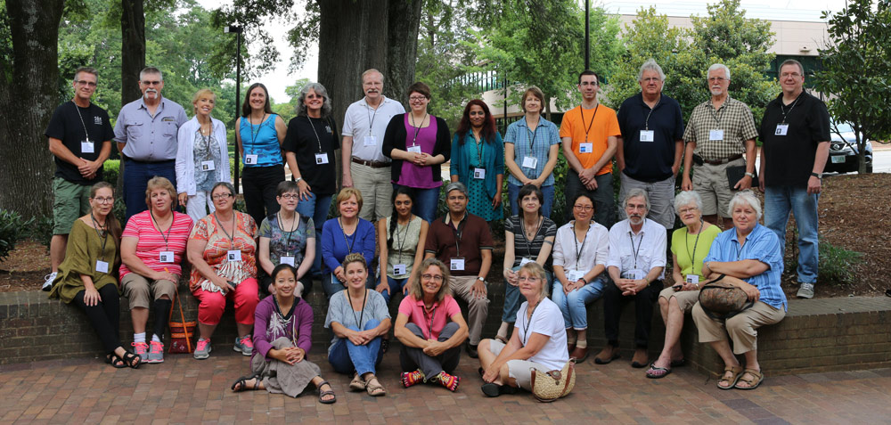
issa-2014-500x477

If you show it, why not show it off?

Looking through online artist portfolios, it’s common to see small images that don’t give the viewer a full appreciation of the work. In those situations I find myself wondering why the artist chose to present the work so small.

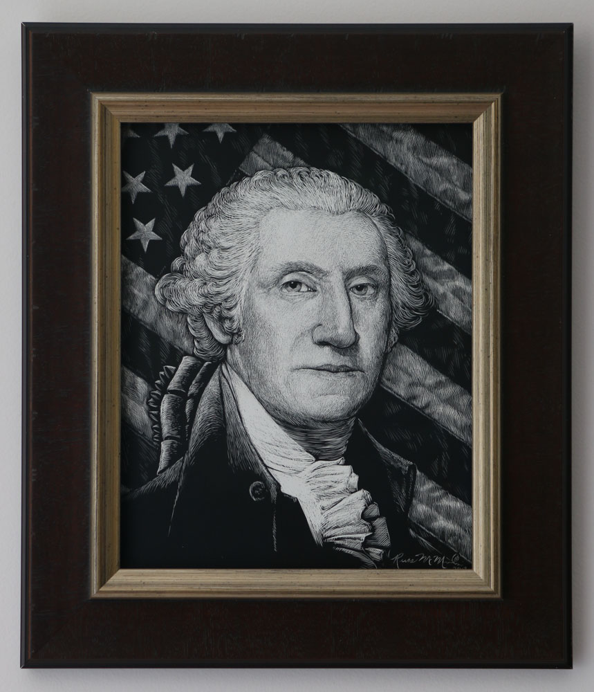
To illustrate what I’m talking about, the same image is shown at two sizes below. The small one is good enough for a thumbnail, but it doesn’t have enough detail to give more than a general impression of the work. At the small size you don’t see any of the scratch patterns in the background. The large size is much more interesting. Though not big enough to use for a high-resolution print, it shows enough detail to give the viewer a better appreciation of the original.


Interesting video about protecting your work online – or not

This post isn’t necessarily about scratchboard, but it relates to thoughts I’ve had while searching for cool scratchboard work to share and talk about. I often run across sites that attempt to keep people from stealing their artwork. The zeal to keep artwork safe can drive people like me away because I’m not interested in looking at tiny thumbnails or images with massive watermarks. I think in the long run it is counter productive to try to keep someone from taking a copy of your image.

Here are the methods I see people using to protect their work, and the reasons I think they do more harm than good:

Posting small images
If you make images so small they aren’t attractive to someone who would steal them, they are also not attractive to someone who might be interested in admiring your work, or buying it. If you want your work to be seen and appreciated, you must post it large enough to give someone an idea of what it really looks like. Security through obscurity is an especially bad tactic when it comes to artwork.
Putting a big watermark over the image
The watermark is supposed to keep people from using your artwork. It probably accomplishes the goal, but it also makes your image unsightly. Looking at artwork with large watermarks is about as fun as looking at classic cars with parking boots on them – very distracting. There is nothing wrong with a signature or small watermark that identifies you and your site. But, it should be in a corner, not splashed across the image.
Making the image so you can’t right-click it
Once you put an image online, there is no way to keep someone from downloading it. One of the simplest is to take a screenshot of it. There are others. If someone wants your image, they can get it.
Using a viewer so only a portion of the image can be seen at a time
With multiple screenshots and Photoshop the large image can be recreated. Nice try, but it doesn’t work if someone really wants your image.

The fact is, you can post relatively large images, and they still won’t have enough resolution for someone to make a quality print. If you couldn’t tell already, I am a strong advocate for posting images that are large enough to be appreciated. Yes, there is a chance someone might take an image and use it without our authorization. There is a much greater chance that someone will see the quality of the work and become a paying customer.

My good friend put together an interesting video post that deals with the same topic:

Russ McMullin – Church on Agave Hill

My work schedule has been brutal, but I finally found time to finish this piece. My opportunities to do illustration are few these days and this project is one I did for fun. The church is loosely based on one I saw and sketched. The location is plucked from my imagination. The board is 5×7 Ampersand. I used an Olfa 9153US AK-1/5B Standard Art Knife for the scratching. Once the image was transferred to the board it took approximately 4 hours to complete.

chuch-with-agave

Prepare a sketch for scratchboard

With this sketch I took some inspiration from the architecture of a catholic church I passed while on a family outing. The church is tall, yet simple. My drawing doesn’t look much like the church, but it was what got me thinking about it.

The sketch is rendered in blue Papermate ballpoint, my favorite sketching medium. I tend to sketch on lined paper – something I’ve been scolded for. It’s a habit from school and a psychological crutch. I have proper sketchbooks, but generally do better work in lined notebooks because I don’t worry about the outcome.

1-iglesia-sketch

The snake is not symbolic. It was already on the page when i started the church. The church sketch kept growing until the two ran together. When I pulled the image into Photoshop I erased the snake and cropped the image to a ratio of 5×7.

The bottom of the composition seemed too plain, and I thought it would be nice to have something in the foreground. With a new Photoshop layer and my Wacom tablet I added an agave plant, and played around with the clouds.

2-iglesia-rework-sketch

Continue reading