
Every so often I return to Brian Gallagher’s illustration blog, and I’m always captivated by his handling of buildings. I like how the rendering is actually fairly simple, but they really convey a lot of feeling to me. They are nicely designed and the values are great.
CNC engraving bits as scratch tools
I think it’s the nature of scratchboard artists to constantly look for new tools, even if their current set of tools works perfectly well. For example, I have done the majority of my work with #16 and #11 Xacto blades, and they have served me very well. But, tiny steel points don’t hold up forever, and eventually I have to reach for a new blade. Durability is probably the first reason a scratchboard artist would seek for a new tool that does essentially the same thing as an Xacto blade.
Several years ago a friend of mine did me a favor and made me some scratch blades out of discarded cobalt deburring blades. To try them out he let me borrow me a pin vise for a few days and I thought they were great. Not long after that came the flurry of activity in my life that involved getting married and moving across the country. The little steel blades were the last thing on my mind at the time, and lay forgotten in a storage box until last summer. When I finally looked at the bits again, I realized I didn’t need a pin vise. I could drill a 1/8″ hole in a section of dowel and insert one of the bits. They are great tools. I included a photo in a post back in August.

Of course, I wondered if might want to try grinding some of my own, and I couldn’t remember what they were and what material they were made of (later found out they were cobalt deburring blades). I thought they might be milling bits, but my searches turned up some bits that didn’t look like what I had. They actually looked much better. They were carbide steel engraving bits for CNC machines.

They look a lot like some of the fancy blades I’ve seen other scratchers use. They fit just right into the 1/8″ holes in my dowels. So, with even more excellent tools, I guess it’s time to dust off some of my works in progress and put these tools to use.
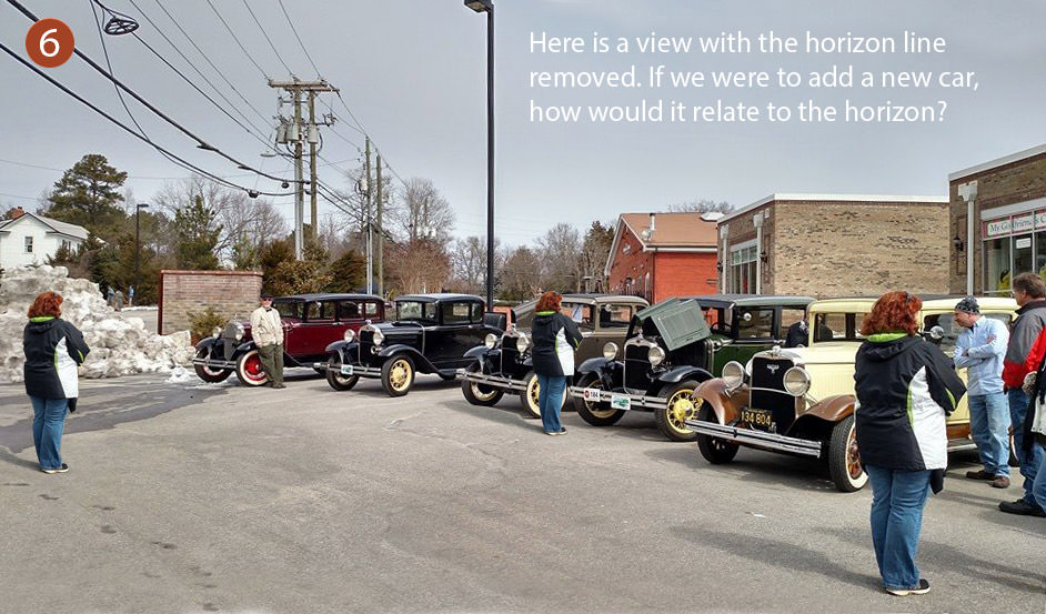
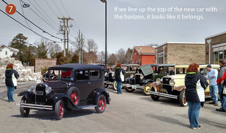
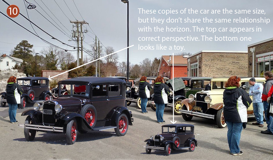
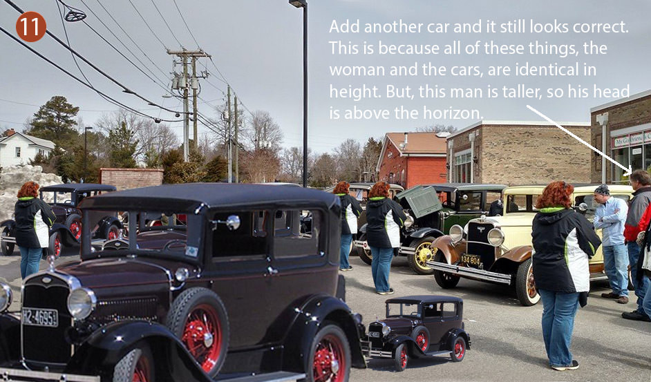
A photo tutorial on perspective – adding elements to a composition
This isn’t a scratchboard post, and it’s been way too long since I posted something about scratchboard. But, I thought this might be useful to someone.
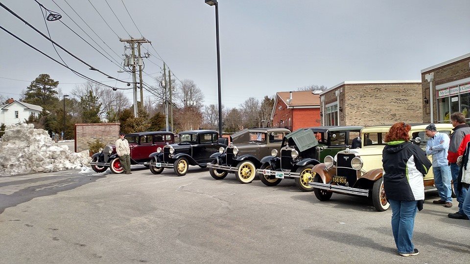
I’ve been talking to my niece recently about perspective she is learning in school. I wanted to help her understand the concepts better if I could. Later, my friend Ginger Gehres posted this photo on Facebook. I saw how the cars all lined up neatly at their tops, and it gave me an idea. Ginger gave me permission to use it for a tutorial on perspective.
The purpose of this tutorial is to show how objects can be easily added to the composition using knowledge given by the horizon line. It isn’t a comprehensive tutorial, but the information is useful. It shows what can be done even without drawing a lot of vanishing points and lines. I’m using Photoshop to add, clone, and resize objects, but it could be done old school with a photocopier and tracing paper.


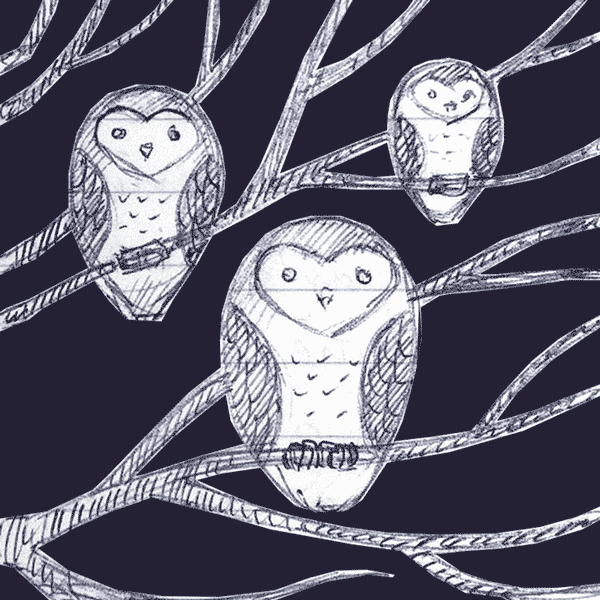
Russ McMullin – Owls, tree, and stars – progress and finish
My latest scratchboard is more illustrative than realistic.

For it I borrowed the basic design of an owl that my sister burned into a wooden spoon.

I wasn’t trying to achieve realism, but I wanted to include at least a hint of it. I started out by doing some sketches


And then I started refining:

Once I settled on the design, I transferred it to a 5×7 board with Chaco paper and red ballpoint pen:

For scratching I used a sharpened steel point that a friend made for me. It works great and has stayed sharp.
Initially the leaves were way too bright and competed with the owls for attention. I inked over them with a Faber Castell PITT artist pen brush, waited for them to dry, and re-scratched them. Even then they seemed too bright:

So, I pushed them back a little further with a diluted ink wash using Ampersand “black repair” that comes with their set of scratchbord inks:

The stars came last to give a background that wouldn’t compete with the owls. I’m feeling pretty good about the result. Now I’m trying to decide if I’m going to add some color.
Roadside lily in scratchboard
I was going to take some work-in-progress shots of this, and then got too focused on trying to finish. The reference comes from some huge lilies that were growing up the street a while back. The light coming through the pedals made me think it would be a good scratchboard subject. I would love to be done, but I can’t go any further tonight. So far I have about 5 hours in the rendering, maybe 6. The board is a 5×7 Ampersand and I used an Olfa art knife for the scratching.
I’ve got some ideas for a background, but I’m going to test them on another board first. It might be cool to scratch a background pattern and then knock it back a bit with the airbrush that’s been sitting idle, waiting to be experimented with. I hope to post the final by Saturday if all goes well.
UPDATE for Thursday night. Small edits:

Wednesday night:

First impressions of airbrush on scratchboard
I found just a few minutes to experiment with the airbrush tonight. I first put straight water through the brush to get an idea of how it feels. When I was comfortable with the action, I emptied the water from the cup and wiped it out. I put several drops of Ampersand black ink (straight from the bottle) into the cup and started testing on a manila folder.
With about 20psi on the regulator I experimented with the MAC valve on the airbrush. By turning a little thumbscrew on the bottom of the airbrush you control the air pressure. Very handy.
As long as I was very patient I could get some fairly even gray patches. Building the ink up to solid black takes a while and it seemed I was prone to getting the area too wet. Then the ink would start to spider out. I probably had too much pressure and was working too close.
Dialing the pressure back gives a different pattern. Instead of laying down smoothly, the ink does a very fine spatter pattern. I really need to learn better control of the pressure.
But, even without being good at making solid blacks I can already see some very useful things the airbrush can do. Without much effort I can add a mist of gray to areas that may be overscratched, or that need to be pushed further back.
I used a little sample of Claybord when I got more comfortable with the brush. I made one corner a pretty solid black and made a gradient fade into white. As I got impatient I ran into more problems with spidering. The clay surface is harder and doesn’t absorb like the folder does. Airbrushing requires patience. My experiment looks pretty lame, but it was a very useful exercise.
When I scratched back into the airbrushed ink, I was pleased with the result. After a bit more practice and a better setup of my work area I will start working on something for real.

I need a better place to hang the airbrush
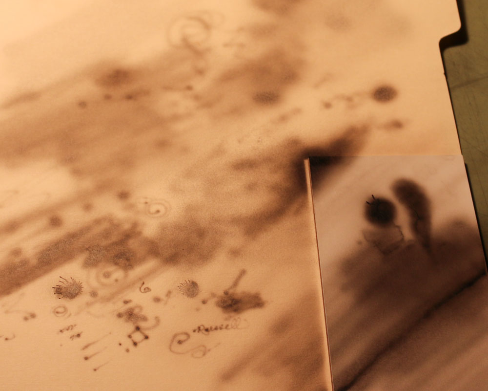
A manila folder worked well for an experimental surface. The Claybord sample is on the right.
Getting ready to try an airbrush on scratchboard
With the exception of the compressor, this is my setup so far. I got it all put together last night, and fixed a leak with teflon tape and a tighter connection. I’m just about ready to start putting ink through the brush.

Here is an explanation of my configuration from left to right:
- Air hose – 1/4″
- It has 1/4″ female connections. I’m not sure how long it is, but this type of hose is easy to find at just about any hardware store. I’ve had this for years so I’m not sure what I paid for it.
- male-to-male adapter – 1/4″ – $3
- This is the type of item you end up making an extra trip to the store for. I didn’t think I needed one until I ended up needing one.
- Quick disconnect – 1/4″ – $5
- In case you are wondering how all of these fittings are 1/4″, it refers to the inside diameter, not the outside. It consists of a plug and a socket. The quick disconnect isn’t required, but it will make life easier when it comes time to put everything away. These are common items and can be found near the air hoses.
- Air compressor regulator – $13
- Because it’s more specialized to airbrushing, I wasn’t confident in finding this item locally. Art and hobby stores sometimes have them, but I opted for Amazon. If you search “airbrush regulator” on Amazon you will see what looks like the same design offered for different prices from different vendors. I picked one that had a 4.5-star rating. The main body has a control knob at the top to control air pressure. It has an arrow on the front to indicate the direction the air should flow. The pressure gauge is included, and attaches to the threaded hole on the front. The threaded holes on the sides of the regulator both accommodate 1/4″ air fittings. There are two 1/4″-to-1/8″ connectors also included. You may not need either of them. I needed one to fit my airbrush hose.
- Airbrush hose – $10
- I chose a brand called “Master Airbrush” because the price was right and it reviewed well on Amazon. It comes with 1/8″ connectors at the ends, regardless of what the picture on Amazon says. If I had purchased an offical Iwata airbrush hose I think I would have required a 1/4″-to-1/4″ connector to attach it to the regulator.
- Moisture trap – $13
- It’s hard to take a brand new airbrush hose and snip it in half, but that is how you install the Paasche moisture trap. The moisture trap comes with directions for installing it between the two sections of hose. There is a screw that can be removed to allow any condensed water to escape.
- Iwata HP-CH – $241
- There were cheaper sources for this model of airbrush, but I wanted to make sure I got it from a dealer I could trust. I ordered from Jerry’s Artarama. If I have any problems I know their store is about a half hour from my house.
Assembly
Assembly wasn’t difficult. Before leaving the hardware store I picked up a roll of teflon tape. I wrapped the threads of each 1/4″ connection with a few wraps of teflon tape. I had to re-do the 1/4″-to-1/8″ connection at the regulator because I could hear it leaking. I wrapped it with some additional teflon tape and went a little tighter with the wrench. That fixed it. I used a couple of small adjustable wrenches to assemble everything for the 1/4″ fittings. The 1/8″ connections were as tight as I could make them by hand, but I didn’t use tools.
Everything is working now as far as air is concerned. I took the time to see how the adjustments work on the regulator. I also experimented with the MAC (micro air control?) valve that is built into the Iwata HP-CH. Instead of touching the regulator, adjustments can be made quickly on the airbrush itself. Now that I have it put together and I’m comfortable with the controls for making adjustments, the next step is to shoot some ink through it. That will be another post.
Having fun with the ISSA scratchboard artists at the 3rd Annual Exhibition
This year the International Society of Scratchboard Artists (ISSA) allowed non-members to enter their 3rd annual juried exhibition. The show is hanging in the Page-Walker Arts & History Center in Cary, North Carolina—less than 10 minutes from my house. It will be up until the middle of August.
A couple of ISSA members contacted me several months before the show and encouraged me to enter. Their warm invitation and my close proximity to the gallery helped overcome my tendency to procrastinate. I entered my artwork and looked forward to meeting the artists and attending the workshops associated with the opening of the show. Previous to the show, several artists posted their entries to the Wet Canvas site and I knew the caliber of the artists at the show was going to be high. I had no expectations of winning anything since my entries aren’t based on photographic reference and my level of detail was courser than what I saw in most of the previews.
Friday at 6pm was the reception for the artists. Cami (my wife) and I showed up and we were immediately impressed with the work we saw. The quality was even better up close and the show was bigger than I had expected. It took up the first and second floors.
Ginger Gehres, the ISSA exhibition director, greeted us and made us feel right at home. Cami and I walked around looking at all the art and talking about the art we liked best. I assured her I would not be receiving an award. There were too many great pieces for me to expect that.
There were plenty of other artists milling about and I tried to put faces to names. At 6:30 everyone was called together and the artists were invited to stand at one end of the room. Andrea Shouten, the ISSA president and Elaine Salazar from Ampersand gave out the awards. There was a master division and an open division. As I predicted, all of the awards were given out and my name was not mentioned. That was until they announced the Special Venkat Award of Excellence. I heard “Church on Agave Hill” and thought it sounded very familiar. Suddenly, I realized in disbelief that it was mine. The award was presented by Krish Krishnan, the son of Venkateswaran K. Krishnan, the donor. I was very surprised and grateful to receive it. I enjoyed creating the artwork and it made me feel good to know that someone else liked it too.
After the awards I got to meet some of the artists. Later I met the group of artists at a restaurant for dinner. It was nice to see their personalities and understand how much friendship they share. Saturday morning I attended a workshops where Rikki Fisher showed her process using a combination of airbrush and fiberglass brush. Elaine Salazar followed with a very informative history of the Ampersand company. She also answered questions about products. In the afternoon Sally Maxwell gave critiques for anyone who wanted to bring their artwork forward. I got to sit in on the ISSA general meeting and, later on, Cami and I met the group of artists again for dinner. We had a great time. There were more workshops today (Sunday), but other obligations kept me from attending. I was sorry to miss more of the fun.
I am very thankful for the kind invitations and all the encouragement I got to attend this year’s event. Next year’s show will be in Maryland and Cami and I are already talking about attending. I will need to join the ISSA in case they decide not to have the show open to non-members. It’s going to be great.
Be warned. If you click on the picture it’s a big file and may take a while.

Excellent scratchboard videos by Cristina Penescu
Cristina Penescu’s work is about as good as it gets in the genre of realistic scratchboard. I can’t think of anyone who has a more consistent portfolio of excellent work.
What sets her work apart from most is her attention to composition and light. She isn’t just taking a photograph and doing her best to mimic it in scratchboard. It’s obvious she is carefully choosing the reference photograph and planning the way it will be presented in the composition, including the background. Her subjects look like they comfortably belong in the space she creates for them on the board. Her use of bright highlights and dark shadows leads the eye on a visual journey through the strongest points of interest. And, her use of airbrush gives her work a greater tonal range than is generally possible with scratching alone.
I also like the fact that she is not afraid to show her work at large sizes. It is easy to admire someone’s work when you can see it in such detail.
I had seen these videos before, and ran across them again as I was researching using an airbrush for scratchboard—something I haven’t yet tried but have a strong desire to try. I wanted to share them here with anyone else who might be interested.

If you show it, why not show it off?
Looking through online artist portfolios, it’s common to see small images that don’t give the viewer a full appreciation of the work. In those situations I find myself wondering why the artist chose to present the work so small.
To illustrate what I’m talking about, the same image is shown at two sizes below. The small one is good enough for a thumbnail, but it doesn’t have enough detail to give more than a general impression of the work. At the small size you don’t see any of the scratch patterns in the background. The large size is much more interesting. Though not big enough to use for a high-resolution print, it shows enough detail to give the viewer a better appreciation of the original.

