I asked Steve Carroll if he would let me show some of his images on the site, and if he wouldn’t mind giving some additional information about his process. He far exceeded my expectations. The images are beautiful and large enough to see the hatching patterns he uses. I had been interested in seeing them up close, and today I got my chance. I am also grateful to learn more about his techniques. Thanks, Steve, for being so willing to share.
Steve also has a Facebook page

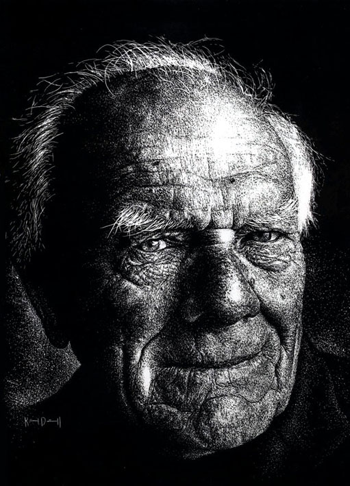
Dave Arcari by Steve Carroll
30cm wide by 40cm high. (11.8″ x 15.75″)


Here is Steve explaining the process in his own words:
First of all, I draw a preparatory sketch of my subject on to thin ‘layout’ out paper which 80 grams per square metre (English spelling!). Once I am satisfied with the drawing, I turn over the paper and cover this side with white conte crayon or chalk. Then I tape down the paper on to the scraperboard drawing side up and using a hard pencil (4H) I draw over the original sketch design with moderate pressure. Once all the main reference lines are transferred on to the board I lift off the paper and with a soft brush take away any loose chalk dust.
Now I have my white lines as a guide, I can start scratching/scraping to my hearts content. I keep minimal contact with my fingers, so I place a sheet of paper under my drawing hand – this prevents smudging the white guide lines. When I am happy that no more scratching is needed I use a slightly damp cloth or paper towel to wipe away the chalk lines and there you will have a smart looking image to be proud of!

I use ‘Essdee’ British Scraperboard. And to cut the black ink away I use ‘scraper cutters’ as seen in the photo. I use the index pen nib to correct the ‘rare’ mistake! by adding Indian ink back on to the surface. (don’t tell anyone this!) As well as these tools, I also have a smooth oil stone to sharpen the cutters as inevitably the blades can become blunt which affects the quality and consistency of the line.
The textures are created by using the crosshatching method and also using a stippling effect.
The latter technique is far more time consuming but rewarding if used in the correct context (see Andrew Townsley’s fleece jacket). On the odd occasion I scrape large areas off altogether and draw and/or dab ink back onto the board, and scrape this again creating a rich and complex texture.
These are just some of many approaches you can try. This medium is only limited by your imagination. So what are you waiting for – get down to your local art store and buy the relevant materials and scrape/scratch away. Don’t worry about making mistakes, remember the index pen nib! And besides, making mistakes is good for you, it’s the best way to learning and improving your techniques.