I like the motion in this one.
Category Archives: people
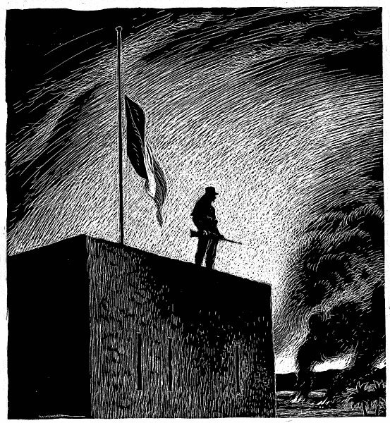
Leslie Gilbert Illingworth – French withdrawal from Algeria
I don’t know the history of this conflict, and I don’t know much about Leslie Gilbert Illingworth. He didn’t seem to do a lot of scratchboard work for his political cartoons. What interests me here is the visual journey. The composition keeps my eye moving around it. There isn’t a lot of detail, but the high contrast light reveals the story in silhouette.
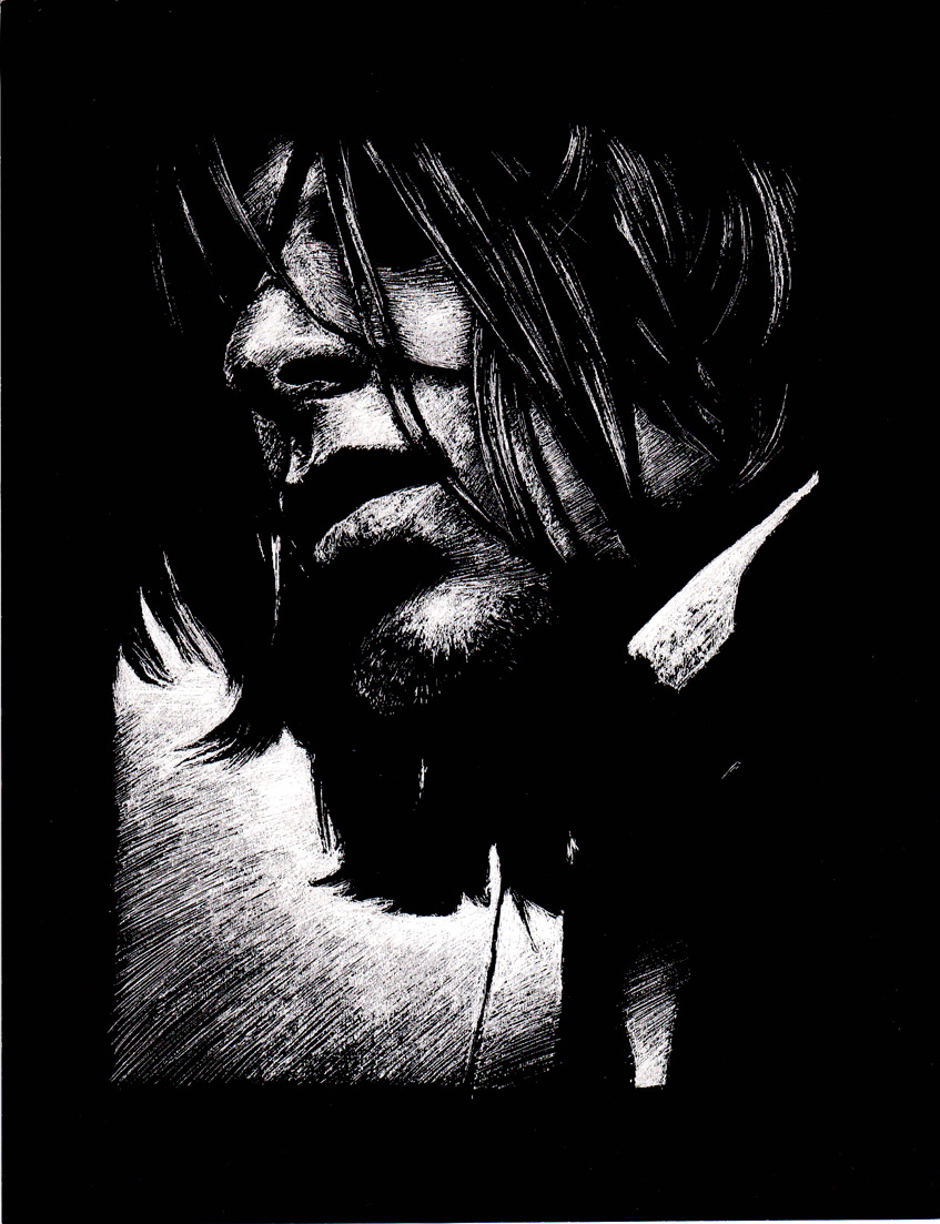
ComradeBitter – scratchboard portrait
Russ McMullin – George Washington with American flag background
This piece isn’t new. It’s been sitting around, patiently waiting for me to decide how to finish it. It had a solid back background that seemed to be calling for more personality. I envisioned an American flag backdrop and today was the day to try it. My wife likes it, and I’m pretty happy with how it turned out.
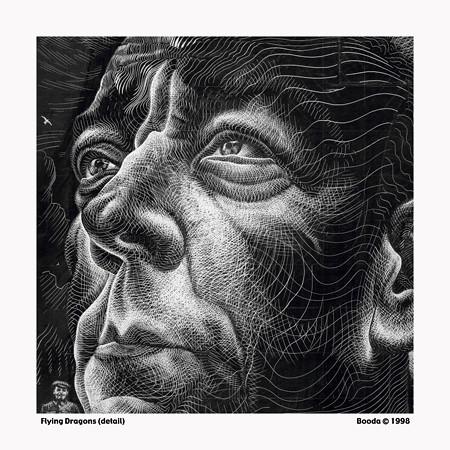
Booda – Flying Dragons
“Booda” is the name on the Flickr account. This piece is seriously cool. It’s a crop of a larger image. I like this cropped version best.
Nico Delort – perspective and sense of scale
Mario Zucca – Scratchboard Illustrations with color
How Mario Zucca manages to say so much with so few lines is a testament to his talent. His illustration style is clear and easy to read, and his color works well. I would guess that the color is probably done digitally. On his website he has a series of portraits from his high school yearbook in scratchboard. They are quirky and fun to look at.
Several things about this image are worth mentioning. I love the textures on the surface of the table and the floor. They are made with rows of line segments. This gives more character to the surface than if the lines were totally straight and continuous. The lamp is another example of varied line treatments as it turns from dark to light.
Nicolas Delort : Harry & Dumbledore
Nicolas Delort does some impressive work. If you click the image it takes you to a visual tutorial of the process. It would be nice if there were some text to go with it. For this piece it looks like he started with a digital sketch that he refined and then traced onto white scratchboard. It looks like he first inked the major outline of the wave and then inked the rest of the surface with some kind of brush-tip marker. It also looks like he is doing quite a bit of line work with the pen in certain areas. Other parts are scratched. Some of his work is very reminiscent of Franklin Booth, which would make sense. Booth imitated etching patterns with pen and ink.
This image links to several other images, and the influence of Franklin Booth is very apparent – especially the clouds. I love the massive appearance of the spaceship. It’s retro and sort of scary and friendly at the same time.
Russ McMullin – My very first scratchboard
I knew this was hiding under a bunch of other work, and I finally found it – the first scratchboard piece I can remember doing. It was for a class assignment. The specific topic eludes me, but I do remember this was inspired by my feelings for greedy college landlords.
This style was influenced by my art teacher at that time, Robert Neubecker. He was an excellent teacher and a very accomplished illustrator. His drawing style is deceptively simple and primitive, yet he conveys such powerful messages with ink lines and watercolor.
I had seen scratchboard work in books, but nobody I personally knew had ever tried it, except maybe in gradeschool. I proceeded undaunted. The only scratchboard available at the art store was thin, like a postcard. It helped forge my strong opinions about using quality materials in art projects. Working on cheap scratchboard isn’t nearly as fun as using a nice brand like Ampersand or Essdee. The difference is night and day. Use good materials and thank yourself for it later.
The feedback from the class was very positive. From that time forward I did mostly scratchboard work, eventually moving to a style with more contour and crosshatching.
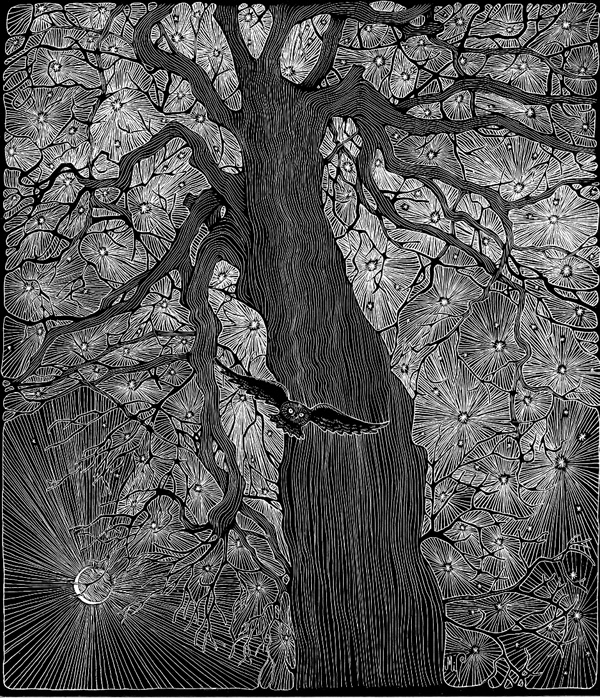
Michelle Dick – Star tree, woman, and turtle
Michelle Dick doesn’t have a lot on her own blog, but other people have posted quite a number of her works. Her designs are solid and I like the patterning she uses. The way the star tree is rendered, it looks a bit scary at first glace – then it takes on the appearance of a wonderful fireworks display. The stark white of the woman’s robe makes a beautiful contrast against the variety of darker tones in the rest of the composition. I especially like the dreamy swirls on the turtle.


